Suklaa Chocolatiera is a branding project crafted to infuse the spirit of Finnish culture into the American palate. Made in Finland, our chocolate embodies the essence of Finnish heritage, seamlessly blending with the natural elements. Our mission is to create a brand that highlights Finland’s essence, warmly engaging with the American audience.
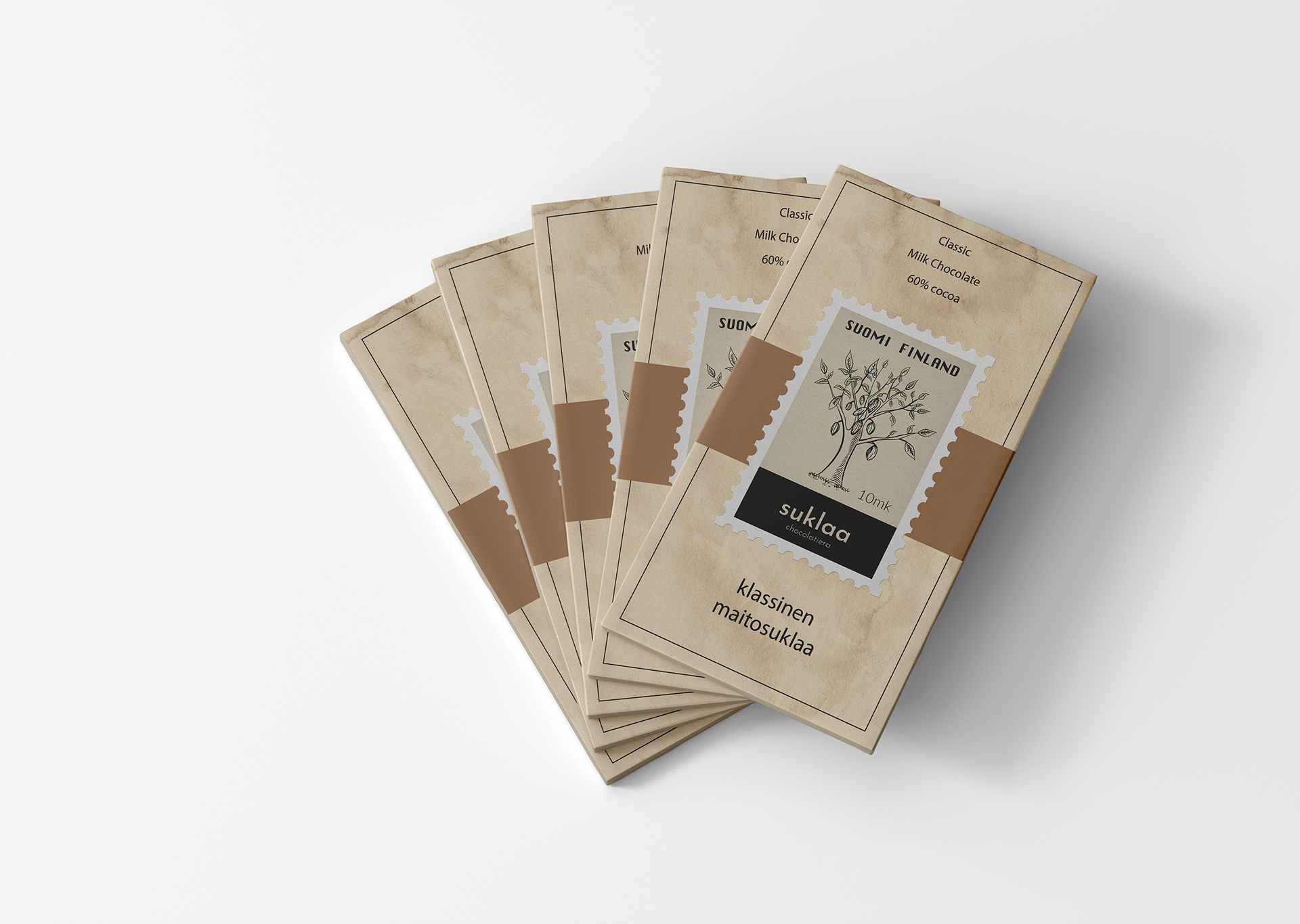
Suklaa Chocolatiera’s logo comes from the rich history of Finland. Finland is full of nature and trees. I wanted to bring the cocoa tree into our brand and show the natural aspect of Finnish chocolate.
The logo doesn't work in every scenerio, this allows us to use them in different variations such as packaging and promotional items to distinguish different flavors and colors. The secondary logos are based on the flavor colors that are present at the time.
One-color logo should be only in black and white and used only on color backgrounds.
To avoid wrong associations between the brand and any other graphic elements, it’s necessary to give it some space to breathe.
The primary colors blend with the secondary colors. I chose colors that paired well, using colors to emphasize different flavors.
The secondary colors are shades of brown that complement the flavors. The browns also represent the packaging that we use, which is textured to look like old parchment paper.
These were the flavors I chose that I deemed fit with the Finnish branding.
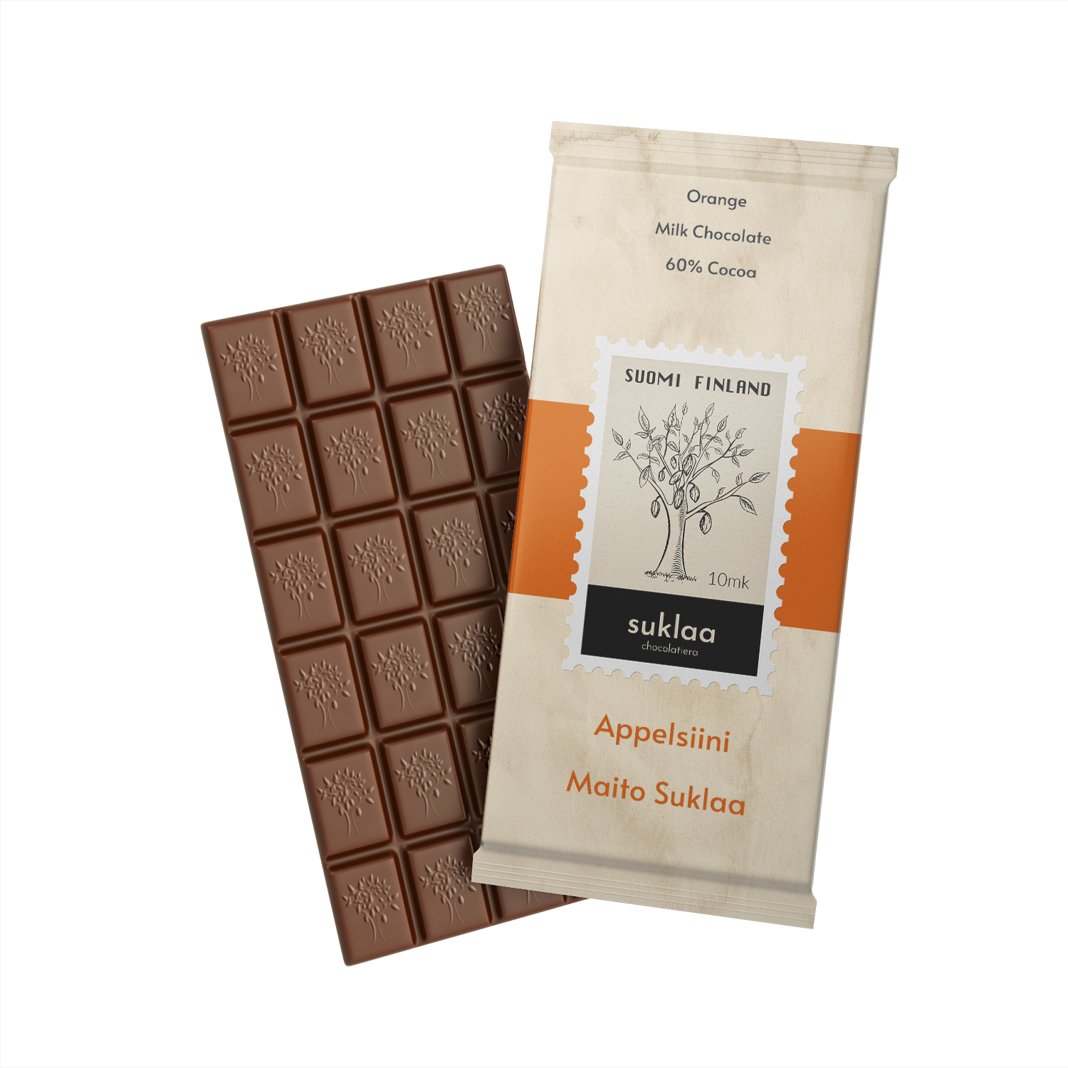
Appelsiini - Orange Milk Chocolate
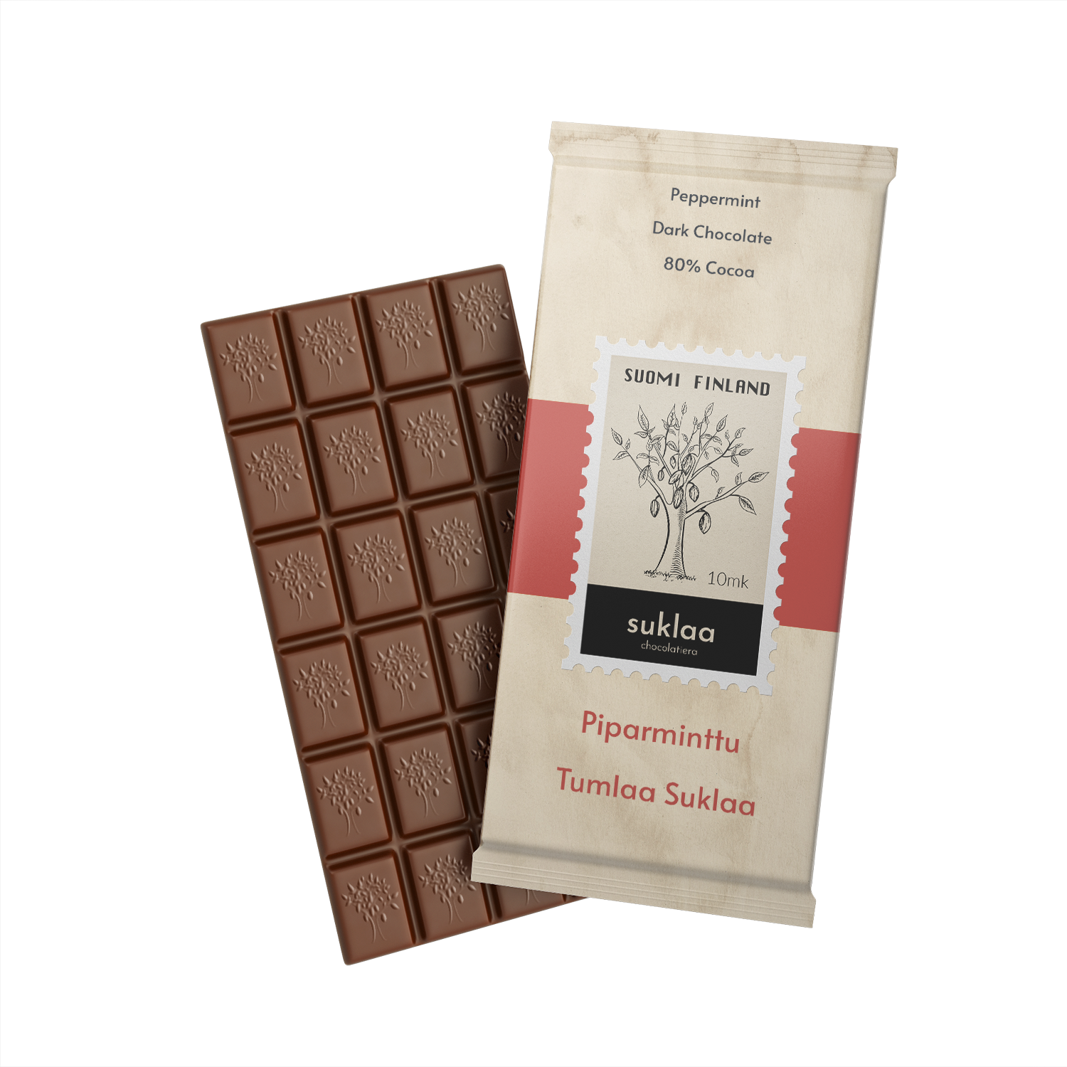
Piparminttu - Peppermint Dark Chocolate
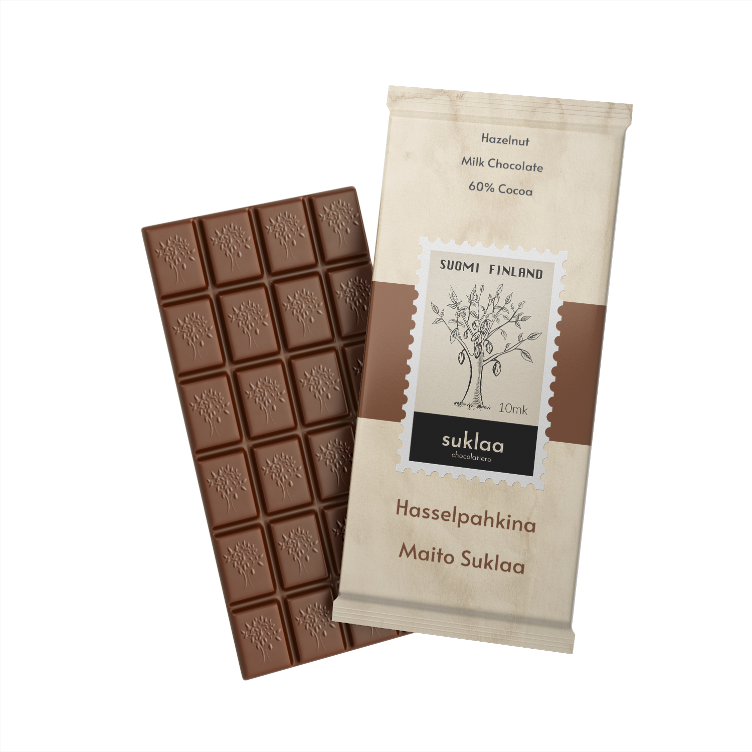
Hasselpahkina - Hazelnut Milk Chocolate
After creating the branding for the project, we went into Wireframes and Comps.


